
How One Vegan Snack Brand Reclaimed 32% Lost Revenue By Fixing a Single UX Mistake
- Rex Unicornas

- Feb 23
- 8 min read
TL;DR:
Green Pulse Snacks, a UK vegan brand, significantly boosted its revenue by applying the UX principle of cognitive load reduction, simplifying their website and checkout process, making it easier for customers to decide and purchase. This case exemplifies the importance of a user-friendly interface for retaining customer interest and improving sales.
How One Vegan Snack Brand Reclaimed 32% Lost Revenue By Fixing a Single UX Mistake
Case Study: The Vegan Brand, The Friction, And The Revenue Leak
This is a story about a small, values-led business that thought it had a marketing problem.
In reality, it had a UX problem.
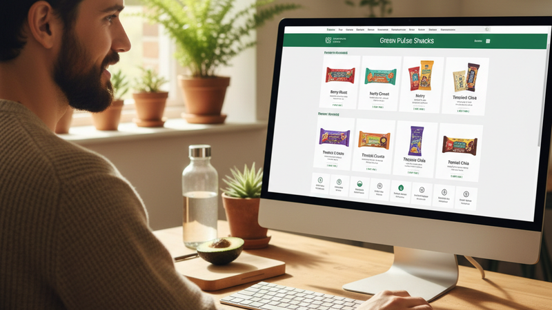
Green Pulse Snacks, a vegan snack company in the UK, had all the right ingredients: fully plant-based products, compostable packaging, transparent sourcing, and a genuinely kind team behind it. Word-of-mouth was strong, their Instagram community loved them, and their email open rates were healthy.
Yet every month, the same nightmare report landed in the founder’s inbox: site traffic up, revenue flat.
They were doing everything ethical founders are told to do. Share the mission. Educate customers. Build community. Still, sales refused to follow the feel-good engagement.
The turning point came when they reframed their core question from:
How do we convince more people to buy?
to something much more honest:
Where are we accidentally making it hard for people who already want to buy from us?
That shift led them to one critical digital strategy every vegan or plant-based business should be using:
Applying the UX principle of cognitive load reduction to their purchase journey.
This case study walks through exactly how that played out, what changed on their website, and the revenue impact that followed.
The UX Principle: Cognitive Load Reduction For Ethical Brands
Before we step into the story, here is the principle they leaned on:
Cognitive load reduction is a UX concept that says: the more mental effort a user needs to spend to complete a task, the more likely they are to abandon it.
Ethical brands are especially vulnerable here, because:
You feel responsible for educating customers about ingredients, values, and impact.
You want your transparency to be visible on every page.
You care about nuance, context, and detail.
The result is often an online experience where:
The story is rich.
The interface looks thoughtful.
The checkout path is exhausting.
Green Pulse Snacks learned this the hard way.
Part 1: The Symptom No One Questioned
Strong interest. Weak sales.
By early 2023, Green Pulse Snacks had:
28% year-over-year increase in organic traffic.
A growing social audience of vegans, flexitarians, and plant-curious parents.
Positive press mentions in two well-known vegan blogs.
Yet their ecommerce numbers told another story:
Add-to-cart rate was decent.
Checkout completion rate was painfully low.
Revenue felt like it had hit a ceiling.
The founder assumed:
Pricing might be too high.
The economic climate was dampening impulse purchases.
Maybe they just needed better email funnels.
They tried discount codes and more aggressive launch campaigns. Revenue blipped up, then slid back again. Nothing stuck.
What they were not looking at yet was the invisible tax on their customer’s attention.
Part 2: The Audit That Changed The Question
Watching real customers struggle
A UX consultant joined their team for a 6-week project. Instead of starting with copy or color palettes, she asked to observe five real customers trying to buy from the site, using remote screen recordings and short follow-up interviews.
These were people already aligned with the brand’s ethics:
Two long-time vegans
One parent buying snacks for a dairy-free child
One athlete exploring plant-based options
One flexitarian trying to reduce meat
Here is what kept happening:
A mission statement.
A long explainer about packaging.
A sustainability timeline.
Three overlapping CTAs.
By the time they scrolled to products, they had already used up attention just decoding what to click next.
Ingredient lists.
Sourcing maps.
Certifications.
A full brand origin story.
An additional comparison table between flavors.
Users praised the transparency, but several said it felt like reading a mini-website inside each product page.
Create an account.
Choose between multiple shipping options, each with a sustainability description.
Read a long note about eco-shipping.
The intent was to empower conscious choice. The effect: decision fatigue.
In interviews, none of the customers blamed the brand. Instead, they blamed themselves with phrases like:
I got distracted.
I meant to come back later.
It felt like a lot, I wasn’t in the headspace.
This is exactly what high cognitive load does: it turns simple tasks into heavy mental work, especially when someone is trying to buy ethically and feels pressure to make the “right” choice.
The consultant named the pattern plainly:
You are overloading people at the exact moment they are trying to say yes to you.
That became the new working problem: How do we keep the ethics visible while stripping mental friction out of the buying journey?
Part 3: The One Strategy They Committed To
Applying cognitive load reduction to the entire purchase path
Instead of adding new features, they agreed on one focused digital strategy:
Systematically reduce cognitive load at every step between discovery and purchase.
They used a simple rule across the site:
If this detail is not essential to making a confident purchase in this moment, either move it later in the journey, collapse it behind a clear label, or remove it entirely.
They made three key sets of changes.
Part 4: Change 1 – A Simpler Homepage With Clear Priority
From mission-first to decision-first
Before, the homepage tried to communicate everything at once: planet, packaging, sourcing, community, products.
After the change, the homepage gave visitors just enough to answer three quick subconscious questions:
What they changed:
Above the fold: a clear headline and one primary CTA pointing to the shop.
Mission and impact: still present, but moved lower, summarized in short, scannable blocks.
Navigation: simplified labels and fewer menu items, making “Shop” highly visible.
How this reduced cognitive load:
Users no longer had to scan dense text to find out where to buy.
Values were still visible, but not competing with the core action.
Result after 30 days:
Homepage click-through to product listing pages increased by 22%.
Time-to-first-product-view decreased, which meant fewer chances for distraction.
Part 5: Change 2 – Product Pages That Respect Mental Energy
From over-education to layered clarity
The original product pages tried to do everything at once: prove credibility, tell the story, educate, and convert.
The team restructured each page using the UX idea of progressive disclosure: showing the most essential information first, and giving the option to explore deeper details without forcing everyone to read them.
What they changed:
Above the fold:
Clear product title.
Trust cues that matter most for their audience: vegan, allergen info, and one short benefit.
Concise description focused on outcome: taste, convenience, how it fits into daily life.
Below the fold:
Tabs or collapsible sections for ingredients, sourcing, packaging details, and brand story.
A short FAQ for each product addressing vegan and allergy concerns directly.
Removed:
Redundant sustainability copy that repeated across every product page.
How this reduced cognitive load:
Customers could quickly answer: Is this safe for me? Do I want this? How do I get it?
Those who cared deeply about sourcing and packaging still had access to full information, but in a controlled, non-overwhelming way.
Scanning the page became effortless, especially on mobile.
Result after 45 days:
Product page to add-to-cart conversion increased by 18%.
Bounce rate on product pages dropped noticeably, especially among mobile users.
Part 6: Change 3 – A Checkout That Protects Focus
From ethical friction to ethical simplicity
Checkout used to be where everything slowed down. The brand tried so hard to honor the environment that they unintentionally put a burden on the customer’s brain.
The team redesigned checkout with one guiding rule: this is not the place for more persuasion or education. This is the place for clarity.
What they changed:
Made guest checkout the default, with account creation as an optional final step.
Reduced shipping options to two clear choices:
Standard delivery with carbon-conscious carrier.
Faster delivery, clearly marked but not guilt-laden.
Moved detailed sustainability explanations to a subtle info link for those who wanted it.
Streamlined fields and removed one non-essential custom message box.
How this reduced cognitive load:
Fewer decisions at the point of payment.
Less emotional friction around which shipping option was the most ethical.
A feeling of permission to complete the purchase without researching every micro-impact.
Result after 60 days:
Checkout completion rate increased by 32%.
Cart abandonment emails recovered fewer people, because more checkouts succeeded on the first attempt.
Part 7: The Overall Impact On Revenue And Experience
After three months of focused work centered on one UX principle, Green Pulse Snacks saw:
32% increase in completed checkouts.
24% growth in monthly revenue, without increasing ad spend.
Lower support volume around basic questions about vegan status or allergens, because key info was presented more clearly.
The most encouraging feedback came from customers:
Parents saying they could now place repeat orders from their phone in under two minutes.
Long-term vegans noting they felt informed but not overwhelmed.
New customers sharing that the site felt calm, even while being packed with ethical information.
The brand did not dilute its values. It simply stopped making customers wade through every detail at every moment.
Part 8: What This Means For Your Vegan Or Plant-Based Business
If you are running a vegan or plant-based business, there is a good chance you are already doing a lot right:
Your products are aligned with your ethics.
Your marketing talks about impact and care.
You genuinely want to help people make better choices.
Yet you may be losing revenue not because people disagree with your values, but because the path to acting on those values is mentally heavy.
Here is how you can start applying cognitive load reduction this week:
Ask them to share their screen and narrate out loud as they try to:
Find a product.
Decide if it is right for them.
Check out.
Notice every moment they pause, backtrack, or squint at the screen.
It might be your homepage, menu, or a popular product page. Ask:
What questions does someone actually need to answer here?
What details could be moved to a click-to-expand section?
What can be said with fewer words without losing meaning?
For example:
Move a long sustainability paragraph into a clearly labelled info panel.
Shorten your above-the-fold mission statement.
Collapse advanced nutrition details behind a tab.
Track:
Click-through from homepage to product pages.
Add-to-cart rate.
Checkout completion rate.
Even a small shift can signal you are lifting cognitive weight off your customer.
Part 9: The Deeper Lesson For Ethical Founders
The hidden cost of many vegan and ethical websites is not lack of traffic, brand love, or alignment. It is accumulated friction.
When you ask people to care about animals, the planet, their own health, and social impact, you are already inviting them to think deeply. That is part of the work.
Your website should not add extra layers of thinking just to complete a purchase.
Using cognitive load reduction as a guiding strategy is not about dumbing anything down. It is about honoring your customer’s limited time and attention, so they can make the values-based choice they already want to make.
Green Pulse Snacks did not grow because they shouted louder. They grew because they made saying yes feel as effortless as it deserved to be.
If you take one thing from their story, let it be this:
You can protect your ethics and your customer’s mental energy at the same time. The businesses that manage both will quietly outlast the ones that confuse complexity with depth.


Comments